A real-world example from Ichilov hospital showing how two generations of apheresis machines illustrate the gap between a clear UI and an effective UX.
A while ago I donated blood platelets at Ichilov hospital in Tel-Aviv. Two generations of apheresis machines were located at the facility, made by the same manufacturer.
Apheresis machines extract blood from a donor, filter out the platelets and retrieve the blood [minus the platelets] into the donor thru the same vascular port.
On the image left — the machine operator is required to follow a laborious prep protocol, threading sterile single use tubing thru multiple pump heads, according to a clear color scheme etched on the front of the previous generation machine.
Image right shows the current generation — all tubing is replaced by a single use cassette, manufactured with all necessary fluid passages built-in. All the operator needs to do is mount the cassette in place and voila!
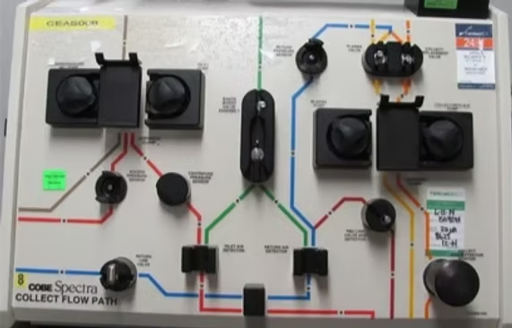
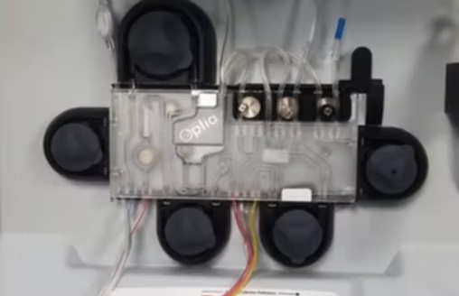
The cassette in the new generation is not only cheaper to manufacture, it's easier to validate, increases safety and reduces time required by operator to prep — an incredible leap, resulting from a study of user pains while operating the earlier machines.